STUDY

Information is often shared in both text and graphics (pictures). The graphics help you to read faster and understand more about the topic. They often use few words, but they give a lot of details. It also helps to see the connections or relationships between ideas. For example, a company might use a graph to show an increase in sales over time.
On the previous two pages, we already saw a timeline and a diagram. A timeline tells you when things happened. You can easily see what happened before and what happened after. A diagram is a picture that shows you the parts of something. For example, we saw a part of an engine and how it moves.
Here are three other common types of graphics:
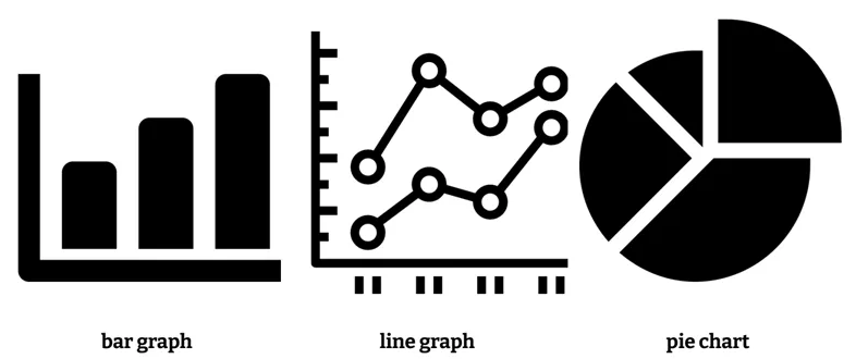
When you see a graphic, follow these steps:
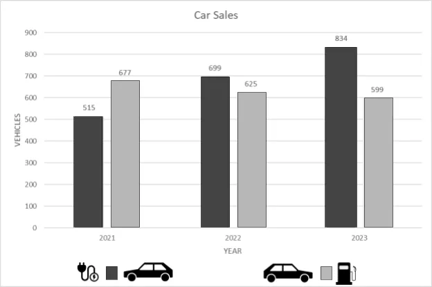
- Look at the pictures: Pictures help explain information. They can help you understand what the graphic is about. In the graph below, we see pictures of an electrical plug and a gas pump. We also see two cars. So the graphic seems to be comparing the two kinds of cars (electric and gasoline).
- Read the title: The title of the graphic is usually at the top. This will usually tell you what the graphic is about. The graph below says "Car Sales". So the data represents sales, not mileage or something else.
- Read the labels: Labels are like names. They help explain the meanings of different parts of the picture. In the graph below, the vertical axis on the left has a label of "Vehicles". The horizontal axis on the bottom is labeled "Year". So we understand that each bar represents the number of cars sold.
- Look at the key: Sometimes graphics use a key to help you understand what the different colors or symbols mean. In the graph below, the key tells us that the darker color represents electric cars while the lighter color represents gasoline cars.
- Read the numbers: Numbers show details. In the graph below, each bar also has a number to give the exact amount of sales each year.
- Think about what you've learned: What is the graphic telling you? Do you understand it better now? In the graph below, we can see that the sales of electric cars are increasing over time while the sales of gasoline cars are decreasing over time.
|

Bình luận