- describe percentages and fractions
- describe a pie chart
- improve your grammatical range and accuracy
- use the passive voice.
|
01. The pie chart represents the main way of finding out the news by adults in the UK in 2015. Predict which section of the chart represents TV, radio, print, online and 'not specified'. Explain your predictions to your partner.
|
02. Match the descriptions (a-e) with the sections of the pie chart (1-5).
|
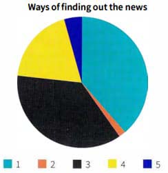 a. Just over a third of people access the news online.
b. The largest proportion of people, about 40%, watch the news on TV.
c. Only a tiny minority did not specify how they find out about the news.
d. Radio is the least popular way to get news, at just 7%.
e. Approximately 15% of people read the news in print. |
03. Where do you get your news from? Talk about:
|
- the types of news that interest you
- the different sources you use
- why you use them.
|

Bình luận