Reading Skill: Interpreting Bar Graphs and Tables
Kỹ năng đọc: Đọc hiểu biểu đồ cột và bảng
What is a bar graph?
A graph is a mathematical picture. A bar graph (or bar chart) compares different amounts of something. The height or length of a bar answers the question "How many?" or "How much?"
Biểu đồ là một hình ảnh toán học. Biểu đồ cột (hoặc biểu đồ thanh) so sánh các lượng khác nhau của một thứ gì đó. Chiều cao hoặc chiều dài của thanh trả lời câu hỏi "Bao nhiêu?"
How do I read a bar graph?
- Read the title. What is the main idea?
- Read the labels on the left. What do they measure?
- Read the labels on the bottom. What do they measure?
- Read other labels or notes. What do they say?
- Look at the height or length of the bars. How do they compare or contrast?
Example / Ví dụ
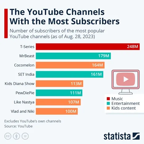
1. The title explains the graph. The information helps us to know the most popular YouTube channels. (Here, a "subscriber" is a regular visitor.)
2. The labels on the left are the names of different YouTube channels.
3. There are no labels on the bottom. However, each bar has a number. The number answers the question "How many subscribers?" For example: Cocomelon has 164M (164,000,000) subscribers (M = million).
4. Near the top, we can see Aug. 28, 2023. That answers the question: "How old is this information?"
5. We can compare and contrast the length of each bar. We can see that T-Series is the most popular. It has many more subscribers than the other channels. We can see that "kids content" is very popular (Cocomelon, Kids Diana Channel, Like Nastya and Vlad and Niki). It is interesting that several of these channels are from India.
What is a table?
1. A table has numbers or words written in rows that go across and down the page.
2. Each row is a new item in a group.
3. Each column is a different kind of information.
4. We can compare and contrast information about different members of one group.
1. Bảng có các số hoặc từ được viết thành hàng ngang và dọc trên trang.
2. Mỗi hàng là một mục mới trong một nhóm.
3. Mỗi cột là một loại thông tin khác nhau.
4. Chúng ta có thể so sánh và đối chiếu thông tin về các thành viên khác nhau trong một nhóm.
How do I read a table?
- Read the title. What is the main idea?
- Read the labels of each column. What are the categories of information?
- Read other labels or notes. What do they say?
- Read each row from left to right. What can you learn about one item?
- Reach each column from top to bottom. How do items compare? How do items contrast?
Example / Ví dụ
Percent (%) of U.S. Adults Who Use Social Media Sites
Source: Pew Research Center
1. The title explains the main idea. The table answers the question: "How many adults in the U.S. use different social media sites?" (%) = percent; this means out of 100%, or out of the total).
2. The columns have labels. The first column says the year of the information. The other columns are different social media sites.
3. The little words at the bottom give the source of information: Pew Research Center. We can check it. Is it a good source?
4. Read left to right: We can see which site was popular. For example: LinkedIn was more popular than Instagram in 2013. But in 2016, Instagram became more popular than LinkedIn.
5. Read top to bottom: We can see that the numbers for Instagram changed quickly. It grew fast. The numbers for X (Twitter) also changed, but only a little. In fact, they are starting to go down. That means Instagram is more popular than Twitter. Facebook is now, too!

Bình luận